During class, we were able to be more practical with the program Tableu. As I was using the Mac’s in the lab, unfortunately most of my work saved on that desktop could not transfer through email.
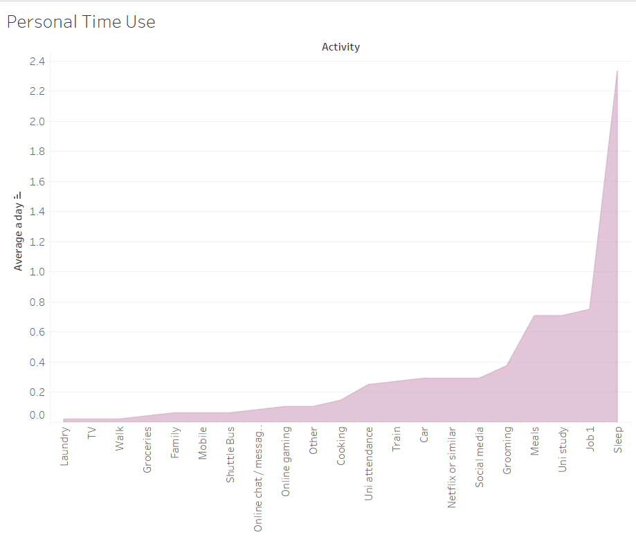
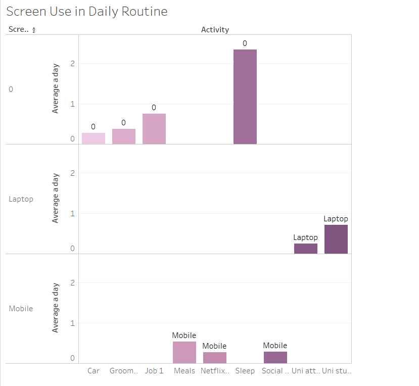
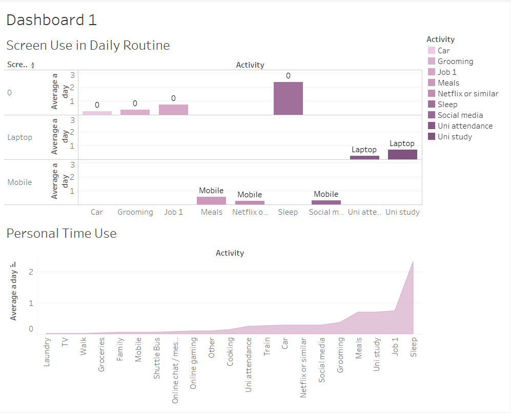
But regardless, as shown above, in this task we were able to visualise the class data into a graph. Each graph shown is of a different topic being portrayed, for example the screen use time – it categorises the different types of screen use and highlights which group is more active.
