Graphs are used to represent data information visually. This is supported in its various ways of presentation styles rather than for aesthetic purposes, which designers often mistake the use of graphs for. The main idea is that the reader is able to understand what this graph is presenting and what information is serves to document.
We use graphs to make comparisons easier.
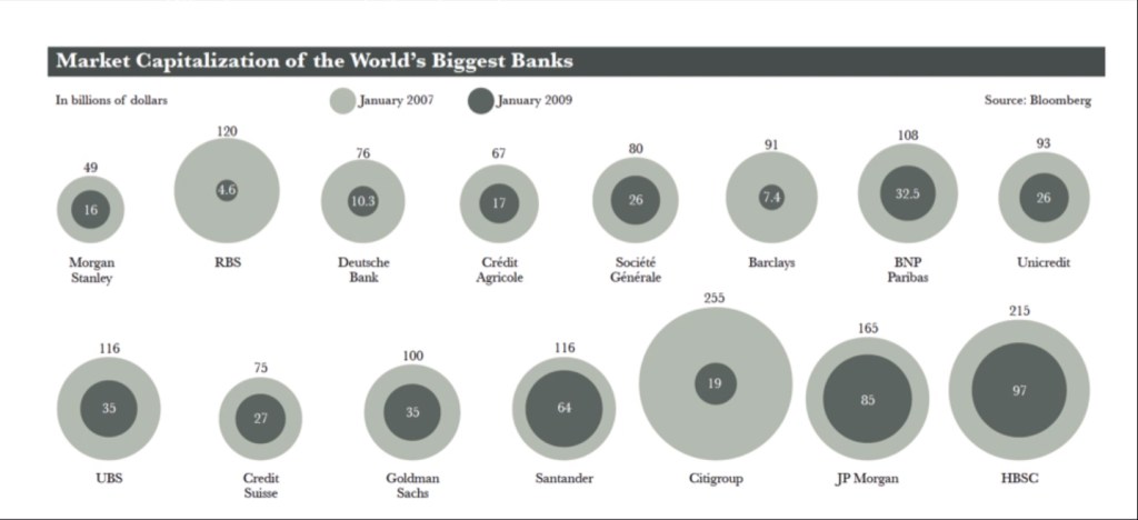
This graph is another example of a graph style. It determines the Maket Capitalisation of the World’s Biggest Banks in January 2007 and January 2009. The circles are used to represent the billions of dollars for each category, which are separated using colours and scaling of these circles as they are stacked over one another.
It is important to consider the human perception of graph presentation styles when creating a chart. For instance in the chart above, our eyes are able to quickly determine the less and greater number of which bank made more of less throughout 2007 and 2009. This is all thanks to the practicality of the graph.
Reflection:
I’ve learned that in order to make an effective and efficient graph, you have to consider the reader’s point of view and the practicality of the the graph when implementing the data information. Though it may seem tempting to go through with an aesthetic approach, enabling a graph with legible design is more effective for comparisons.
