In this TED Talk, David McCandless talks about the beauty of visualisation as he discusses various attributes to how and why it is so glorious. Data visualisation is so important in the way it stores information which can be understood within a short time if the design is curated in a practical and appealing structure. But of course, in order to design – data and statistical information plays a key role in this in the process.
Data visualisation allows us to intake information without feeling so bombarded with numbers and information. The way in which the numbers and categories of the graph resonates is relieving and settling.
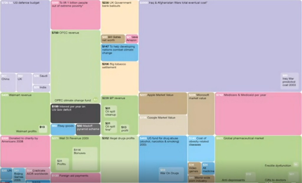
This image arose out of frustration as they state the purpose and relationship between the numbers, for example purple is for fighting and red is for giving money away. It shows the priorities and how money is being used in each categories.
Reflection:
The beauty of data visualisation is purposeful in the way of our life to understand information given to us, so we can process the data. The numbers and visual factors are important in helping us combat the issues that arise to show the differences in our future and to also compare.
