What story does it tell?
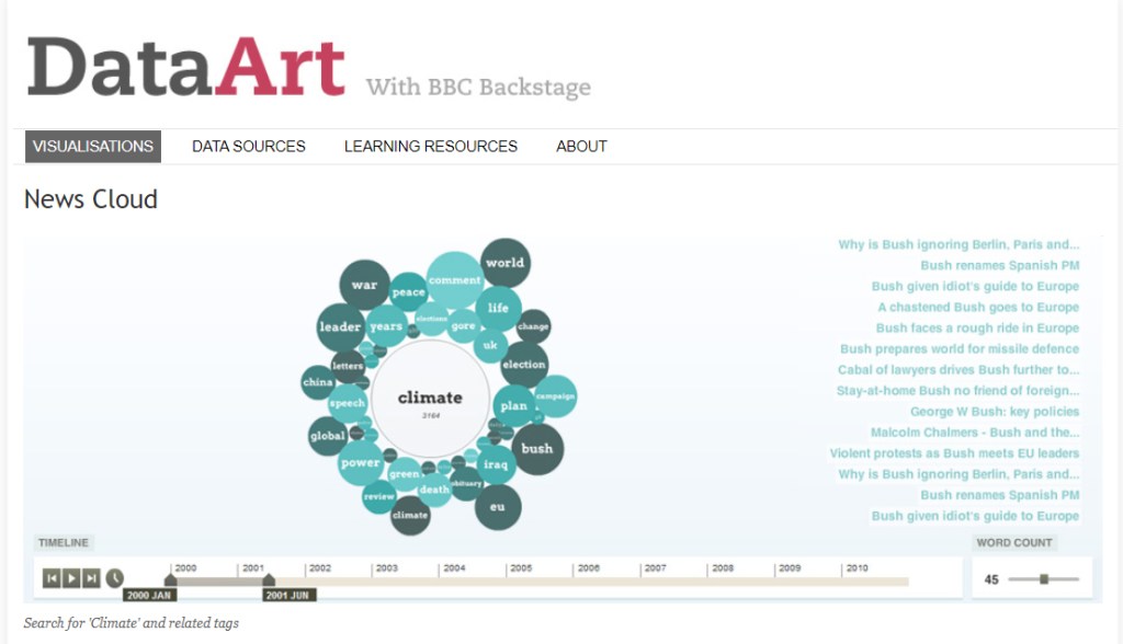
News Cloud is basically a data visualisation of an archive that keeps track of keywords relating to the key point that fluctuate over time.
How does it tell it?
Each term within the visual data is representented as a circle that depends on their sizing, the scaled from smallest to biggest range from the least to most popular search term.
Does it allow for different levels of interrogation that can be seen or used on the part of the reader?
The reader is able to use the timeline tracker to help understand the changes and popularity of each search term throughout the years. They are also able to interact with the circles when they click on them – each circle basically has a articles and list of stories relating to the keyword. There is also a ‘word count’ slider that enables the reader to see few or greater number or terms.
Are you able to create multiple stories from it? If so, what are they?
Multiple stories from this data visualisation can be made, as there are many pathways that lead to the related words and many options you can specify with. Such as the timeline reader and word count when looking for specific details.
It shows that as the years go by, different search terms tend to be less or more popularised depending on what events occur on that year.
What can you say about the visual design- layout, colour, typography, visualisation style?
The visual design of News Cloud is overall a basic and simple approach that is legible for most readers. It provides the standard use in an ordinal manner – the scaling matches the colour, the greater the darker.
The colour scheme used is within the same tones to align with the centre topic. Typography used is concise and consistent all around.
What improvements would you suggest?
Improvements that could be made to this data visualisation is the typography style. This could enhance the chart if the type choices differentiated themselves in hierarchy.
Where does the data come from, and comment on it’s source:
The data originates from BBC News, where exclusive news articles are most prevalent and well-known amongst the audience. Hence, the News Cloud keyword data visualisation to help support their articles through their archiving.
