TED Talk ‘Art made of storms’ by Nathalie Miebach talks about her journey on visually transferring and depicting information in different fields.
She talks about what it takes to create a good data visualisation. This includes all internal and external factors, whether it be referring to statistical information and the group of categories. In comparison to the visual and music aspect of this, she goes on to talk about how the challenges arose and how she was able to combat these difficulties.
Data Art
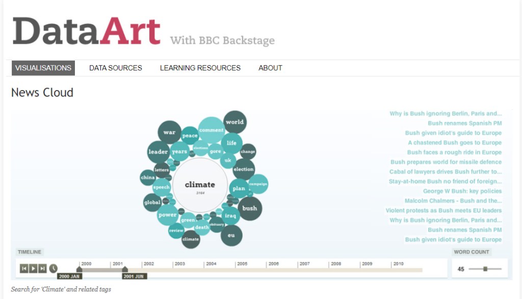
What story does it tell?
News Cloud is basically a data visualisation of an archive that keeps track of keywords relating to the key point that fluctuate over time.
How does it tell it?
Each term within the visual data is representented as a circle that depends on their sizing, the scaled from smallest to biggest range from the least to most popular search term.
Does it allow for different levels of interrogation that can be seen or used on the part of the reader?
The reader is able to use the timeline tracker to help understand the changes and popularity of each search term throughout the years. They are also able to interact with the circles when they click on them – each circle basically has a articles and list of stories relating to the keyword. There is also a ‘word count’ slider that enables the reader to see few or greater number or terms.
Are you able to create multiple stories from it? If so, what are they?
Multiple stories from this data visualisation can be made, as there are many pathways that lead to the related words and many options you can specify with. Such as the timeline reader and word count when looking for specific details.
It shows that as the years go by, different search terms tend to be less or more popularised depending on what events occur on that year.
What can you say about the visual design- layout, colour, typography, visualisation style?
The visual design of News Cloud is overall a basic and simple approach that is legible for most readers. It provides the standard use in an ordinal manner – the scaling matches the colour, the greater the darker.
The colour scheme used is within the same tones to align with the centre topic. Typography used is concise and consistent all around.
What improvements would you suggest?
Improvements that could be made to this data visualisation is the typography style. This could enhance the chart if the type choices differentiated themselves in hierarchy.
Where does the data come from, and comment on it’s source:
The data originates from BBC News, where exclusive news articles are most prevalent and well-known amongst the audience. Hence, the News Cloud keyword data visualisation to help support their articles through their archiving.
Useful Links
- The Data Visualisation Catalogue: this website includes different visual types you could integrate your data information into.
- Flowing Data: blog about data visualisation where it discusses different visuals and what topic is being discussed within, it also provides information about what data visualisation is all about
- RAW Graphs: program where you can visualise your data(e.g. Microsoft Excel sheet) by uploading it onto there and it allows you to rearrange and edit.
- Plotly: can make charts from your data source on their chart studio software.
- Chart.js: an open source-chart library where people can freely make their own data visualisation but it is restricted to six visual types.
My Time
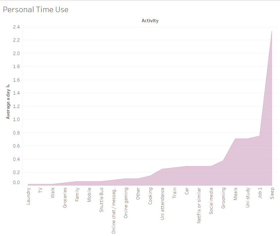
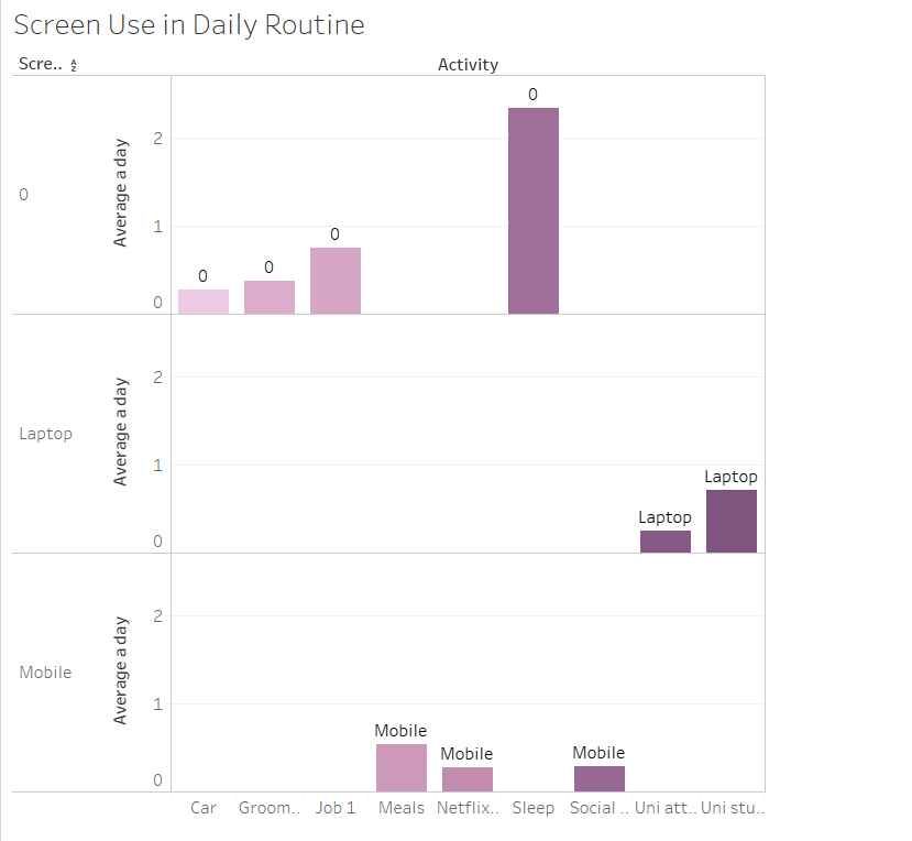
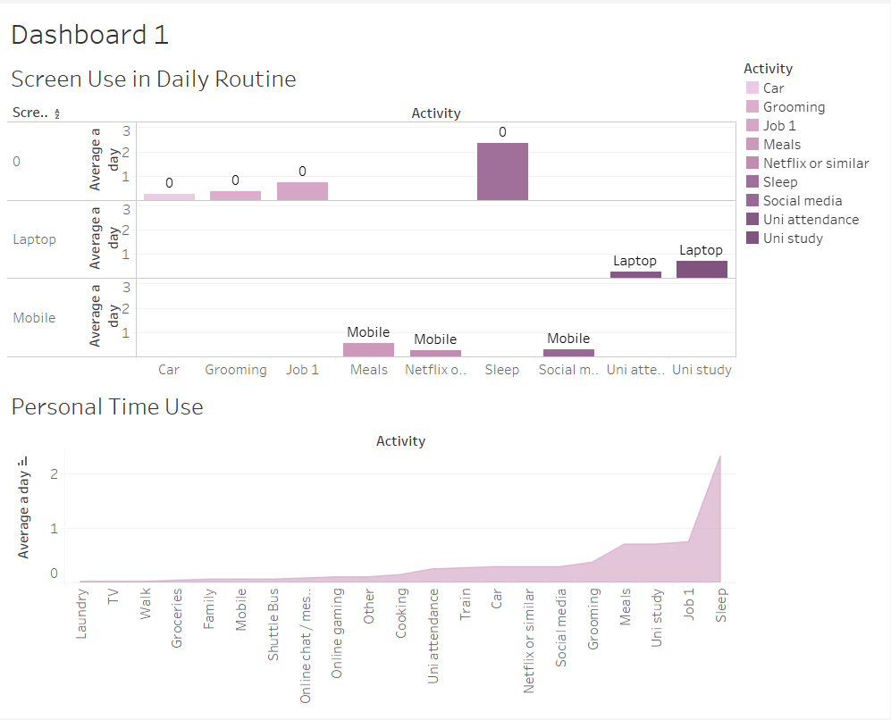
During class, we were able to be more practical with the program Tableu. As I was using the Mac’s in the lab, unfortunately most of my work saved on that desktop could not transfer through email.
But regardless, as shown above, in this task we were able to visualise the class data into a graph. Each graph shown is of a different topic being portrayed, for example the screen use time – it categorises the different types of screen use and highlights which group is more active.
Week 7: David McCandless: The beauty of data visualisation
In this TED Talk, David McCandless talks about the beauty of visualisation as he discusses various attributes to how and why it is so glorious. Data visualisation is so important in the way it stores information which can be understood within a short time if the design is curated in a practical and appealing structure. But of course, in order to design – data and statistical information plays a key role in this in the process.
Data visualisation allows us to intake information without feeling so bombarded with numbers and information. The way in which the numbers and categories of the graph resonates is relieving and settling.
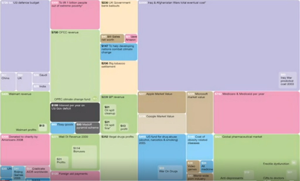
This image arose out of frustration as they state the purpose and relationship between the numbers, for example purple is for fighting and red is for giving money away. It shows the priorities and how money is being used in each categories.
Reflection:
The beauty of data visualisation is purposeful in the way of our life to understand information given to us, so we can process the data. The numbers and visual factors are important in helping us combat the issues that arise to show the differences in our future and to also compare.
Week 6: Data Journalism
Part 1: What is Data Journalism?
It’s about using the power of data. They key information and data is important of the process of it. You are enables to do an interactive map, rather than being confined and restricted to just text or image based articles. Data Journalism gives you the power to interpret information visually, giving the designer a controlled environment of what they want the reader to focus more on.
“Journalism is the recognition of the power of measurement.”
– Professor Christoforos Anagnostopoulos
In this video provided by The Guardian, journalists defined what data journalism means and highlighted the importance of it in journalism. It plays a key role in giving an insight to relevant and important articles that text based articles cannot do. It basically is a ‘modern way’ of journalism, not just putting out opinions but it is of actual factual information within that data visualisation.
Part 2: History of Data Journalism at The Guardian
Journalist have been trying to battle with data journalism since the beginning of time and have attempting to present data in an interesting way to the reader in order to attract them.
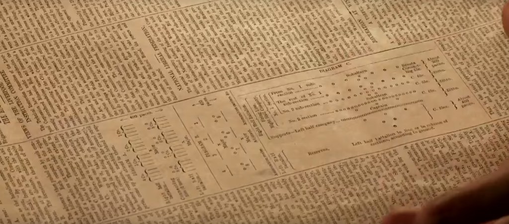
An example of the attempt was in the 1821 of The Manchester Guardian, seen using the new brigade structure of the South African Tactics. This graph was implemented in between the cluster of texts. There were some elements of design and type, every easy and simple attempt at data visualising.
Part 3: Data journalism in action: the London Olympics
People were obsessed about the Olympics and liked to keep track of which countries had obtained more medals in medal tables. This is when data journalism took in place of tracking these numbers of medals according to each country, allowing people to compare the information being given through a graph.
The Guardian had attempted to showcase this data but there were some inconsistent information, so that’s when real statistical information comes into contact to enable an efficient graph.
Week 5: Data presentation Styles – 1: Graphs
Graphs are used to represent data information visually. This is supported in its various ways of presentation styles rather than for aesthetic purposes, which designers often mistake the use of graphs for. The main idea is that the reader is able to understand what this graph is presenting and what information is serves to document.
We use graphs to make comparisons easier.
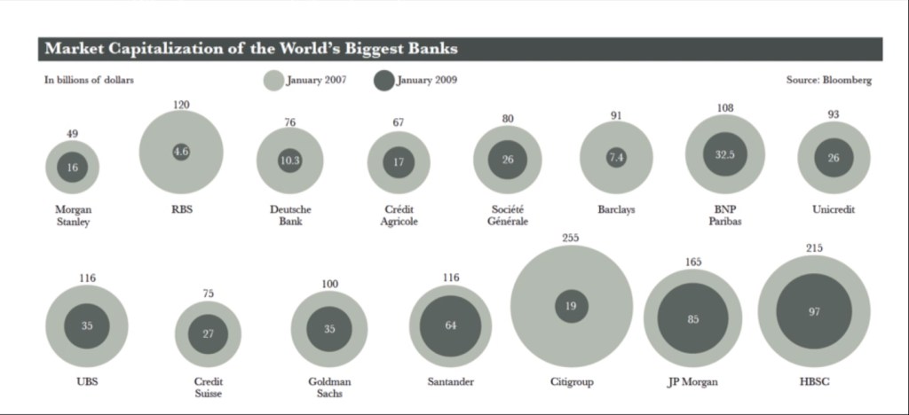
This graph is another example of a graph style. It determines the Maket Capitalisation of the World’s Biggest Banks in January 2007 and January 2009. The circles are used to represent the billions of dollars for each category, which are separated using colours and scaling of these circles as they are stacked over one another.
It is important to consider the human perception of graph presentation styles when creating a chart. For instance in the chart above, our eyes are able to quickly determine the less and greater number of which bank made more of less throughout 2007 and 2009. This is all thanks to the practicality of the graph.
Reflection:
I’ve learned that in order to make an effective and efficient graph, you have to consider the reader’s point of view and the practicality of the the graph when implementing the data information. Though it may seem tempting to go through with an aesthetic approach, enabling a graph with legible design is more effective for comparisons.
Week 4: Visualisation: Historical and contemporary visualisation methods – Part 2
We visualise in order to gain an insight and understand complex articles.
The Functional Art: An introduction to information graphics and visualization by Alberto Cairo: Talks about the world’s population and the rising fertility; countries in poverty. Highlights young group population and the relevant topic on them such as violence.

Fertility rates have been dropping throughout the years. The two trends: rich countries began to rise in fertility while poorer countries have began to drop. Such as the booming economical rate in Brazil; in 1950s there were six children per women to 2010s having less than two children per women.
Fertility rates around the world will converge around 2.1% in a few decades and the world population will stabilise it. The insufficient claims were that if the world population changes, the fertility rate has been negative; the closer to the present the negative the pattern line. Though this graph had made its point, countries such as China and Brazil have began to stabilise their popularity and fertility rate.
Reflection:
I’ve learned that in order to depict difficult social concerns, visualising this data is a strong method in helping readers understand and gain an insight to complex articles. When these statistics are broken down and adhere to design principles aligned with numerical factors, it does wonders and changes. It’s important to document these articles and world changes through data visualisation.
Week 3: Visualisation: Historical and contemporary visualisation methods – Part 1

Historical and contemporary visualisations methods that are being discussed throughout this lecture demonstrate the roots of this method and how it was implemented through time. The examples given were events that took place in war such as The Napoleon’s Invasion of Russia in 1812.
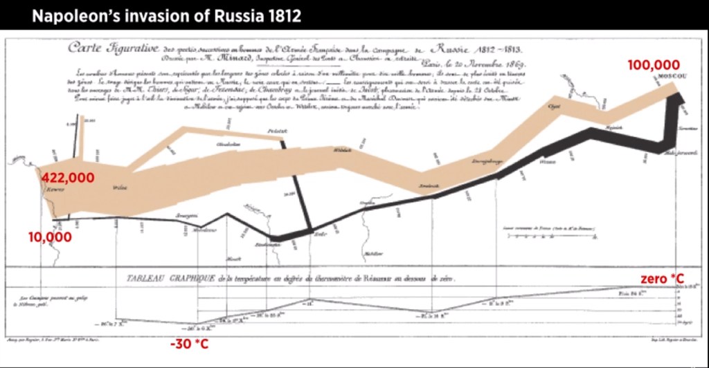
Above is a graph used to document the Napoleon’s invasion of Russia in 1812, which reads from right to left. This chart was created by Charles Joseph soon after the war occurred 50 years after, so in order to document this event there was this chart to document the temperature and distance of which has been curated through a systematic approach in terms of data and design.
Week 2: Data Types
In data visualisation, there are various types of data that can apply the same information but look different.
The types include:
– Nominal: pertaining to names
– Ordinal: order
– Interval: numeric, can do mathematical operations on it but does not have a meaningful zero point. Examples include calendars, temperatures
– Ratio: zero means you dont have anything of that type, some variable examples include height, weight, age, money
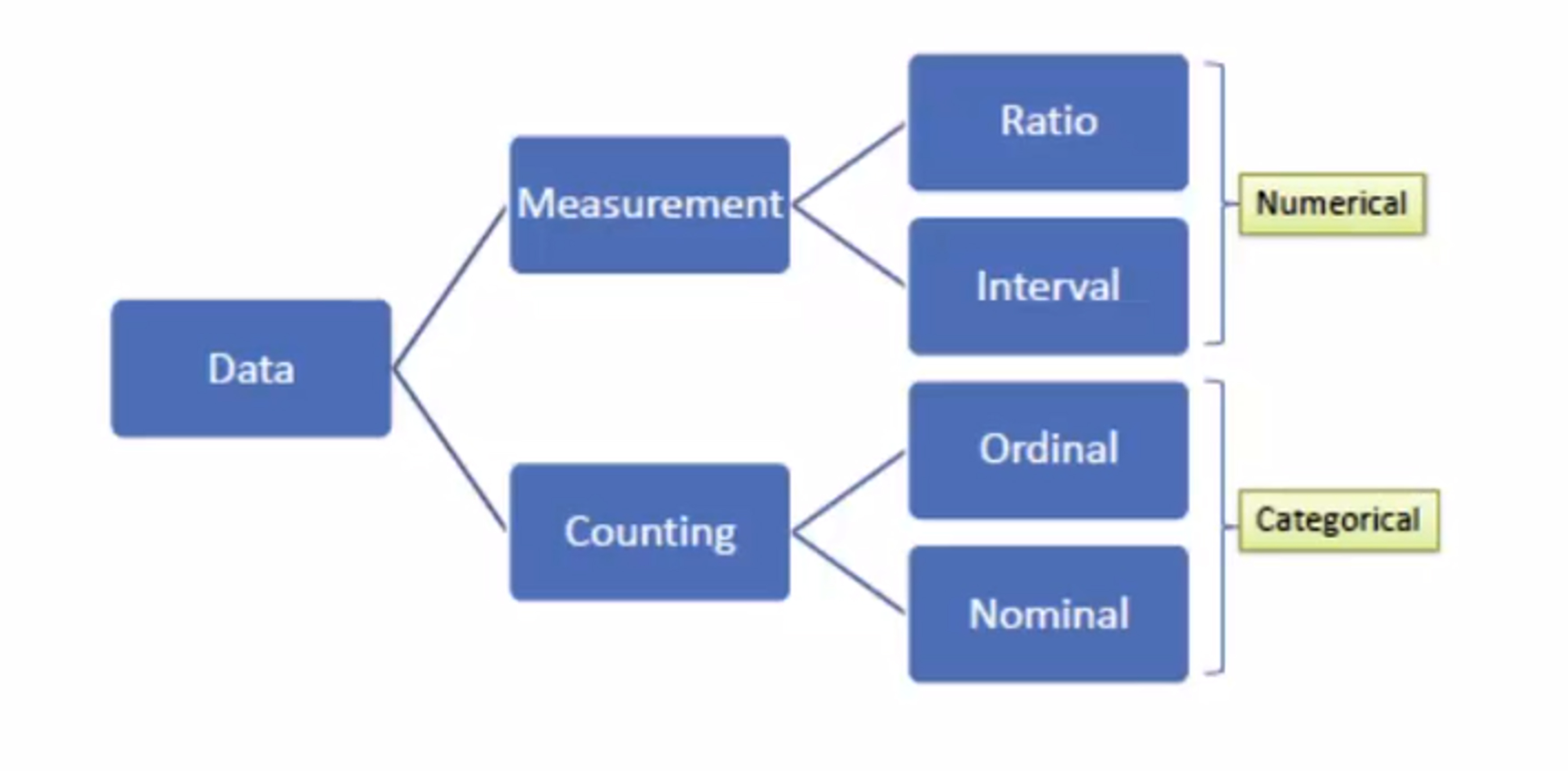
Above is a graph on data types to break them down and differentiate them more easier like how ratio and interval are numerical based while ordinal and nominal are categorical based.
Reflection:
Data types play an important role in data visualisation and acknowledging these different data types have helped further improve my understanding about how data can vary. Categorising these data types enable a better understanding when there is label.
